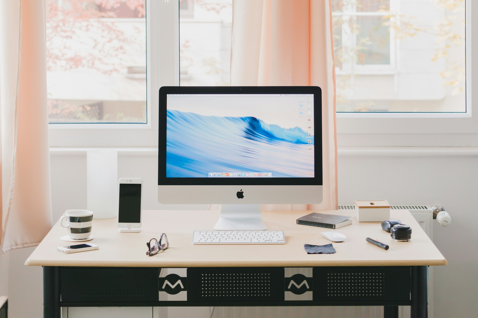
Our Mobile/Tablet Responsive service ensures that your website adapts seamlessly to various screen sizes, providing an optimal viewing experience for users across different devices. Whether accessed on a smartphone, tablet, or desktop, your website will maintain its functionality and visual appeal.
With Mobile/Tablet Responsive design, you can reach a broader audience and enhance user engagement by offering a consistent and user-friendly experience regardless of the device being used. This approach not only improves accessibility but also boosts conversion rates and overall customer satisfaction.
Fluid Layout
Smooth adaptation to screens for readability and proportion.
Touchscreen Compatibility
Enhancing usability with touch-friendly navigation and interactive features.
Performance Optimization
Faster loading and smoother browsing with image compression techniques.
Our Work Process
From Concept to Conversion
Discovery & Strategy
Collaboratively define project objectives, audience insights, and strategic direction to lay a solid foundation for success.
Design & Development
Craft visually stunning designs and implement cutting-edge technologies to bring your digital vision to life, ensuring seamless functionality and user experience.
Optimization & Growth
Continuously analyze performance metrics, iterate on strategies, and implement enhancements to drive ongoing optimization and sustainable growth.
Need Help
Contact Us
Have questions or ready to kickstart your project? Drop us a line! We’re here to listen, advise, and collaborate with you every step of the way. Let’s turn your ideas into reality together.
Join our Community
Subscribe Our Newsletter
Sign Up to Receive Exclusive Updates, News, and Offers from Xoom Solutions Straight to Your Inbox


